This is the new documentation of Custom Applications. You can still visit the legacy documentation during the migration from Project-level Custom Applications.
UI Components
In the previous section we learned how to use data fetching by using the built-in features of Custom Applications. The next natural step when developing a Custom Application is to implement the actual User Interface.
To facilitate the development of UI features, we provide many different ready-to-use components based on commercetools Design System.
Defining the layout
The best way to configure any layout in your Custom Application is to use the <Spacings> components.
Generally, you would use the two main variants of the <Spacings> components: Stack and Inline.
You can think about these in the following way:
Stack: It's about "stacking" elements vertically.Inline: It's about "inlining" elements horizontally.
The <Spacings> components are implemented using CSS Flexbox, which means it's very simple to align children of these elements together and control the spacing between them.
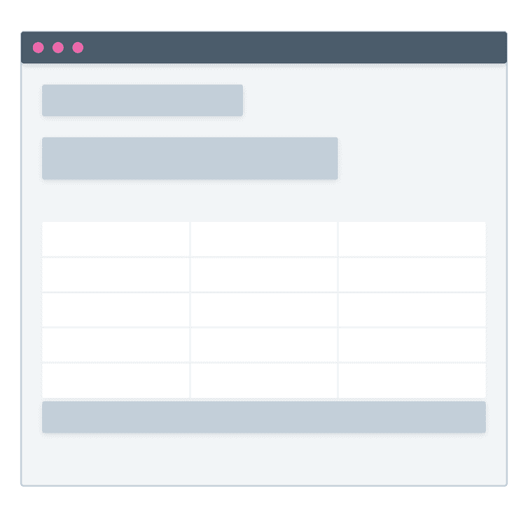
Let's say we are implementing a List Page, which is a page to show a list of a specific resource with optional features like searching, filtering, pagination, etc.
A simple layout might look something like this:
We can already see here that most of the elements are vertically stacked. Therefore, we can start using the Stack component.
import Spacings from '@commercetools-uikit/spacings';const Channels = () => {// ...return (<Spacings.Stack><div>Title</div><div>Description</div><table>{/* Table data */}</table><div>{/* Pagination */}</div></Spacings.Stack>)};
By default, the Stack component has a default scale of s. The scale determines the "space" between each child.
In our Channels component we want some of the elements to be "closer" or "farther" away. To do so, we can nest multiple Stack components with different scale values.
import Spacings from '@commercetools-uikit/spacings';const Channels = () => {// ...return (<Spacings.Stack scale="l"><Spacings.Stack scale="s"><div>Title</div><div>Description</div></Spacings.Stack><Spacings.Stack scale="xs"><table>{/* Table data */}</table><div>{/* Pagination */}</div></Spacings.Stack></Spacings.Stack>)};
The changes we made can be translated as:
- The main outer elements have a
scaleofl, which gives them some more prominent space in between. - The title and description should be closer to each other, but not too much.
- The table and pagination should be very close to each other.
With this in mind, you can define your vertical layout in no time and you can nest as many Stack components as you need.
The same principles apply to the Inline components.
Layout components are one of the most important building blocks of building your User Interface and you'll find yourself using them all the time.
Typography
When it's time to render some text you can use the <Text> components. These components are configured to style fonts according to the Design System rules.
Always try to use the <Text> components. It's important to ensure consistent typography across the Merchant Center.
The <Text> component exposes the following variants: Headline, Subheadline, Body, and Detail.
You can think about these in the following way:
HeadlineandSubheadline: Render headline elements from H1 to H5.Body: For normal content.Detail: For smaller or secondary content.
Let's try to adopt them in our Channels component:
import Spacings from '@commercetools-uikit/spacings';import Text from '@commercetools-uikit/text';const Channels = () => {// ...return (<Spacings.Stack scale="l"><Spacings.Stack scale="s"><Text.Headline as="h2">Title</Text.Headline><Text.Body>Description</Text.Body></Spacings.Stack><Spacings.Stack scale="xs"><table>{/* Table data */}</table><div>{/* Pagination */}</div></Spacings.Stack></Spacings.Stack>)};
Rendering data in tables
One of the most common ways of displaying any kind of data is by using tables.
Chances are that in your Custom Application you would need to do exactly that.
The best way to render data in a table is to use the <DataTable> component, which provides simple to advanced features.
As a first step, you need to define the columns of the table.
const columns = [{ key: 'name', label: 'Channel name' },{ key: 'key', label: 'Channel key', isSortable: true },{ key: 'roles', label: 'Roles' },];
Here we define three columns with the key as the identifier, a label, and we make the key column sortable.
We can then go ahead and render the table.
import Spacings from '@commercetools-uikit/spacings';import Text from '@commercetools-uikit/text';import DataTable from '@commercetools-uikit/data-table';import { NO_VALUE_FALLBACK } from '@commercetools-frontend/constants';const columns = [{ key: 'name', label: 'Channel name' },{ key: 'key', label: 'Channel key', isSortable: true },{ key: 'roles', label: 'Roles' },];const itemRenderer = (item, column) => {switch (column.key) {case 'roles':return item.roles.join(', ');case 'name':const localizedName = item.nameAllLocales.find(field => field.locale === 'en');return localizedName ?? NO_VALUE_FALLBACK;default:return item[column.key];}}const Channels = () => {// ...return (<Spacings.Stack scale="l"><Spacings.Stack scale="s"><Text.Headline as="h2">Title</Text.Headline><Text.Body>Description</Text.Body></Spacings.Stack><Spacings.Stack scale="xs"><DataTablecolumns={columns}rows={channels.results}itemRenderer={itemRenderer}/><div>{/* Pagination */}</div></Spacings.Stack></Spacings.Stack>)};
The itemRenderer is the main function used to render the table cell values. It can be a simple string or some React components.
The rows field is the list of the actual data that needs to be rendered in the table.
